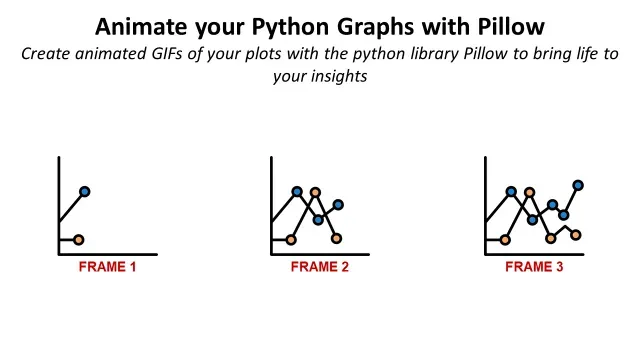
Animate your Python Graphs with Pillow
Animate your Python plots with the Python library Pillow to bring life to your insights.
Animate your Python plots with the Python library Pillow to bring life to your insights.
As a data scientist, your ultimate goal is to present your findings in an engaging and informative way.
But how can you ensure that your data is not only visually appealing but also easy to understand?
Scenario
You are a data scientist who has developed an algorithm or performed advanced analysis linked to a dynamic process.
Because you want to show the impact of your solution, you plot the results using a conventional Python library.
However, your graphs are not self-explicit and do not reflect the dynamic aspect of the process.
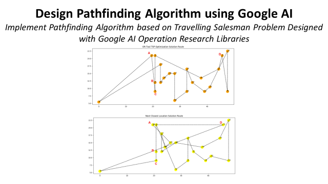
This article will use this example of pathfinding algorithms to show how you can bring additional insights by building GIF animations with Python Pillow.
1. Problem Statement
Example of pathfinding algorith for warehouse picking
2. Objective
The final result will be an animated GIF of a scatter plot.
II. Generating the Frames with Matplotlib
1. Process
An explaination of the complete workflow to generate an animated plot.
2. Intermediate Plots
We start by generating and saving partial plots
III. Creating Animated GIFs with Python Pillow
1. Step 1: Create the function to convert to a picture
Each intermediate plot will be converted to a picture.
2. Step 2: Build the loop to plot each step
Each step leading to the generation of the final plot
3. Step 3: Create the GIF
Combine the frames in animation by fixing the time per frame using PIL
IV. Conclusion
1. Examples of Animation for Transportation Optimization
This method used to generate an animated map showing delivery routes
2. Automate Graphic Design with PIL
Pillow used to generate warehouse labels with a very efficient workflow
Share Insights with Animated Graphs
Problem Statement
In a Warehouse, walking time from one location to another during the picking route can account for 60% to 70% of the operator’s working time.
Reducing this walking time is the most effective way to increase productivity.
Therefore, you have developed several algorithms that optimize the route of warehouse operators to reduce their walking distance.
Task
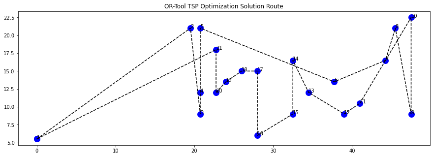
Using an example of a long-picking mission, you want to use a graph to show the difference between the two algorithms.
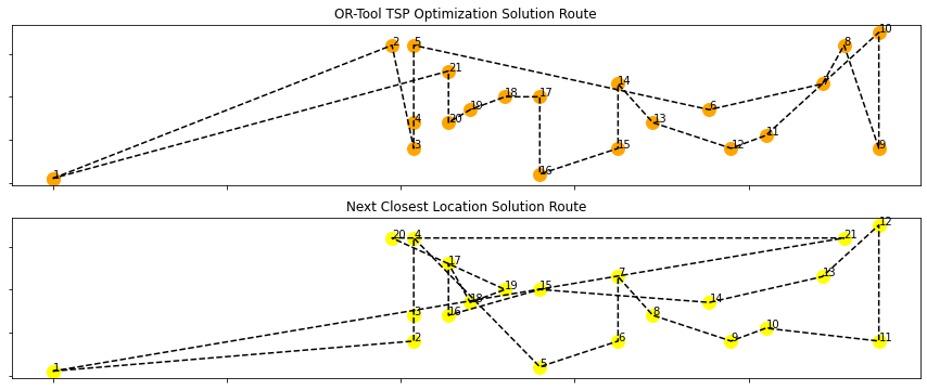
Each dot is a picking location, and the numbers represent the order in the operator's picking route.
However, these graphs could be more self-explicit, and we missed the steps that led to this final result.
Objective
Let us animate this graph to see the sequence location by location and understand the difference between the two solutions.

The final result would be like this animated gif above, where you can follow the sequence of locations visited for two different algorithms.
Let’s start by generating the frames.
🏫 Discover 70+ case studies using Python to automate reporting, generate interactive visuals and support business optimization 🏪 in this Cheat Sheet
Generating the Frames with Matplotlib
Process
Let me first explain how to plot the graph presented above,
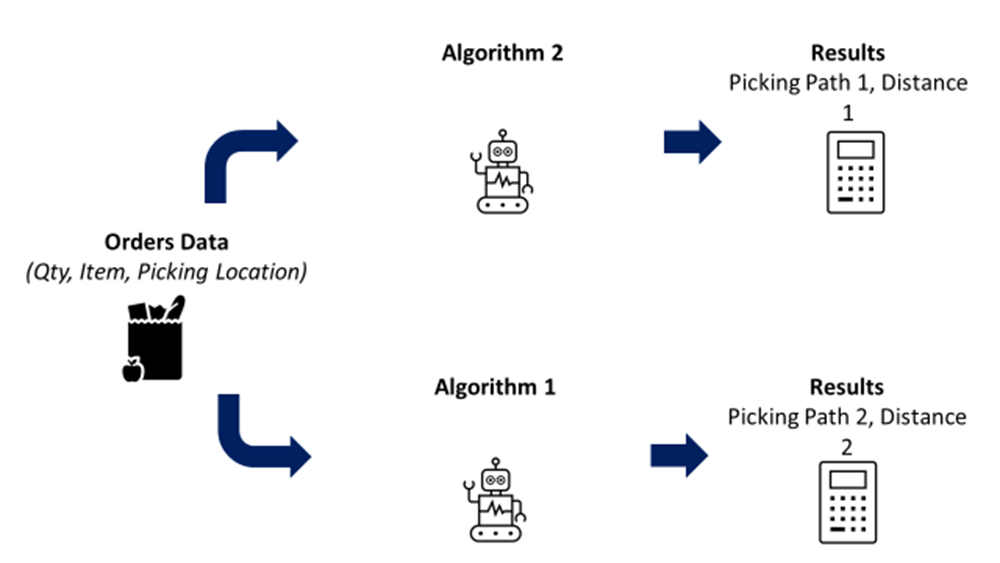
- You import a batch of order lines with Order Number, Item Code, Location Coordinates
- You run the two algorithms that will create the routes for each order
- You export the results with the succession of locations to cover each route
The results look like this,
- In Path OR and Path Init you have the succession of 2D coordinates
- In Distance OR and Distance Init you have the total distance
I won’t detail much about the algorithm.
If you are interested, you can deep dive into the article linked below 👇
Let’s generate the intermediate plots now.
Plot
Let’s take the line with the biggest gap in distance between the two methods and plot the results.
Import the libraries
Because we are going to use scatter plots, we need to extract the coordinates by location for the two solutions.
- We create two lists of the location coordinates for the two solutions
- For each list, we create two sublists to take the x-axis and y-axis coordinates
We can use now the lists (x1, y1, x2, y2) to plot the two paths,
- Plot a dot for each location coordinate (xi, yi) with xi in x1 and yi in y1
- Link the dots with dotted lines ‘ — ‘
- Annotate each dot with the order of the location in the path
The final result is a plot of the complete paths,
How did we arrive at this final result?
Let us detail each step.
Intermediate Plot
You can show the partial path if you truncate the lists used to plot the dotted lines.
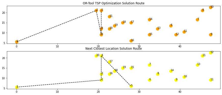
You will reconstitute the picking route by showing partial paths for the first n locations with n varying between 1 and 20.
[Plot 1, Plot 2, … Plot n]: with n the number of locations covered in the path plotted
The final result will be a GIF of these partial paths showing the succession of locations for the two solutions.
Creating Animated GIFs with Python Pillow
The process will be simple,
- Generate plots of the partial paths: step-by-step
- Convert each plot to a picture using the library io and store it in a list
- Create a gif using PIL with the generated list
Step 1: Create the function to convert to a picture
This function will take the figures generated with matplotlib and return a picture with the right format for PIL.
Step 2: Build the loop to plot each step
The images are stored in the list: list_gif
Step 3: Create the GIF
You can create the gif with one line of code,
- You append the first image with the rest of the list
- You can select the duration per picture in (ms)
- Select infinite loop with the option: loop = 0
Final Result
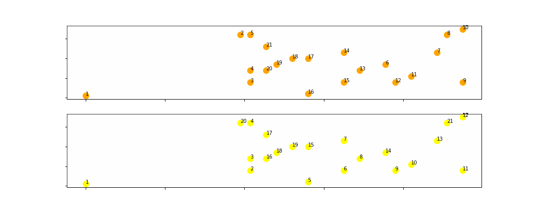
You can now see the succession of picking locations and understand where the two algorithms differ.
Conclusion
With this straightforward example, you can understand the different steps to follow to generate your animated graphs,
- Build a loop that will generate all the frames of your gif
- Create a function to convert your plots to image
- Build a GIF with all the frames, choosing the speed and the number of loops.
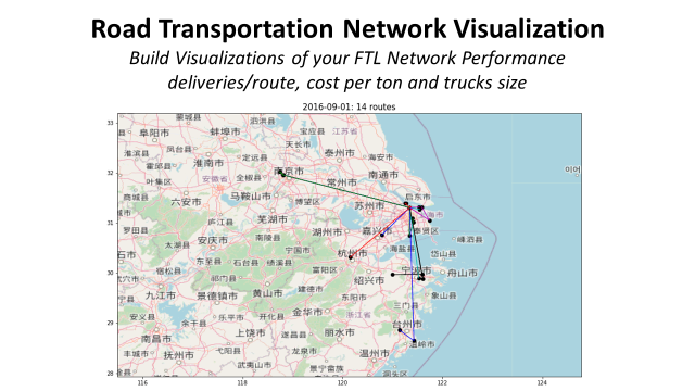
Examples of Animation for Transportation Optimization
You can find other applications of this method for more operational case studies in my previous articles.
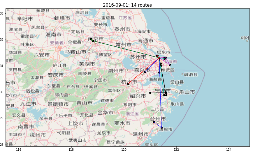
In the animation above, multiple routes are visualized to deliver hypermarkets from a distribution centre in Shanghai.
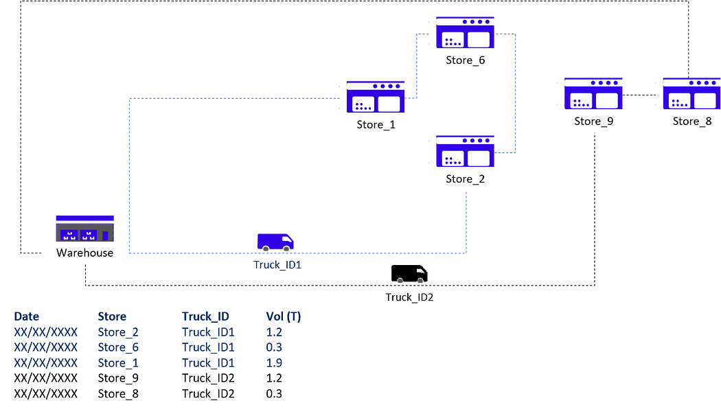
The idea is to monitor trucks' routing to ensure they deliver the maximum number of stores per trip.
What’s the objective? Reduce costs and CO2 emissions.
With this animated plot, we can visualize the routes designed by planners, understand the patterns and find optimization levers.
For more information, check the link below 👇
Do you need support to automate graphic design?
Automate Graphic Design with PIL
In another article, I share the issues implementation managers face when setting up a new warehouse facility.
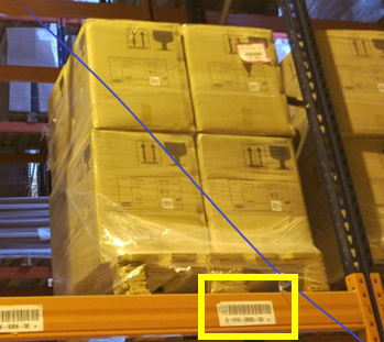
They must manually create hundreds of labels for racks, shelves and workstations.

Can we automate this process?
Instead of generating graphs, you can create visuals, illustrations, or labels, as in the example below.
These labels have been automatically generated by a Python script using the PIL library.
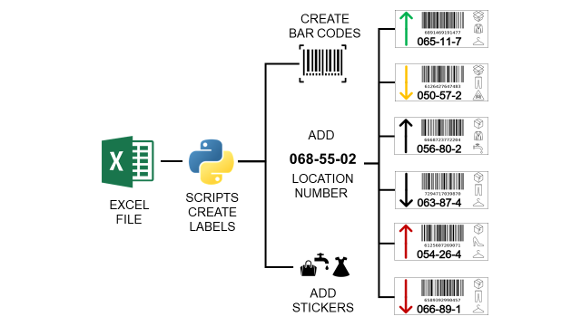
Using Python, I designed a completely automated workflow to generate labels based on parameters stored in an Excel file.
If you want to implement it, check the details 👇
If you prefer, you can watch the video version of this tutorial,
About Me
Let’s connect on Linkedin and Twitter. I am a Supply Chain Engineer who uses data analytics to improve logistics operations and reduce costs.
For consulting or advice on analytics and sustainable supply chain transformation, feel free to contact me via Logigreen Consulting.